Theme-Based Research
Sources of Information:
Link1
Link2
Link3
Part of this year’s theme involved including information on tax rebates. We decided to research two federal tax rebates, as well as a PA only tax rebate. We sourced our information from the U.S Department of Energy and the Environmental Protection Agency, as well as the PA Department of Energy. We focused primarily on rebates that had to do with Solar, Wind, and Geothermal energy, as these were the three types of energy that are easiest for homeowners to install, and that we covered extensively on our website.
Sources of Information:
Link
Web-Design Research
One feature we wanted early on was stationary backgrounds. We wanted it so that the user could scroll down and still be able to see the background, as if the website itself was moving, and not the image behind it. Through our research, we found that this could be achieved using Elementor, by:
Editing a Container > going to its Style Attributes > going under Background > Attachment > and selecting Fixed
We utilized this feature on many pages of our website, including the Home page.
Sources of Information:
Link
Sources of Information:
Link
Sources of Information: Linked Below
Sources of Inspiration
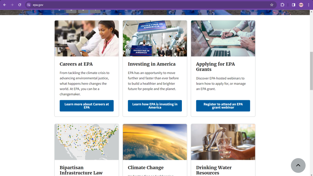
Symmetrical Info Boxes
We modeled our Sustainable Practices page after the home page of the EPA’s website. The EPA utilized symmetrical boxes with images at the top, and we thought this looked very clean and concise, so we created a similar graphic.
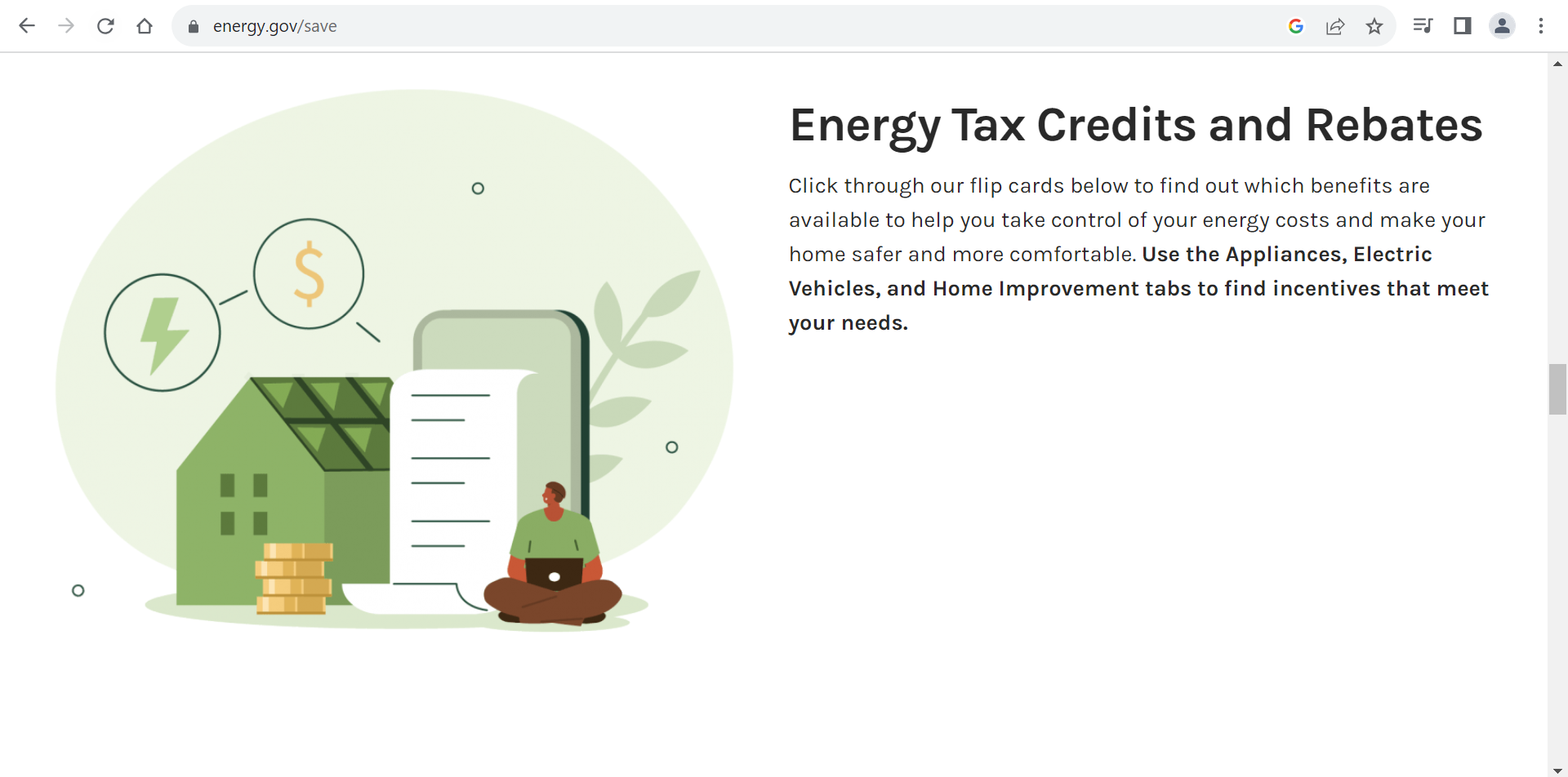
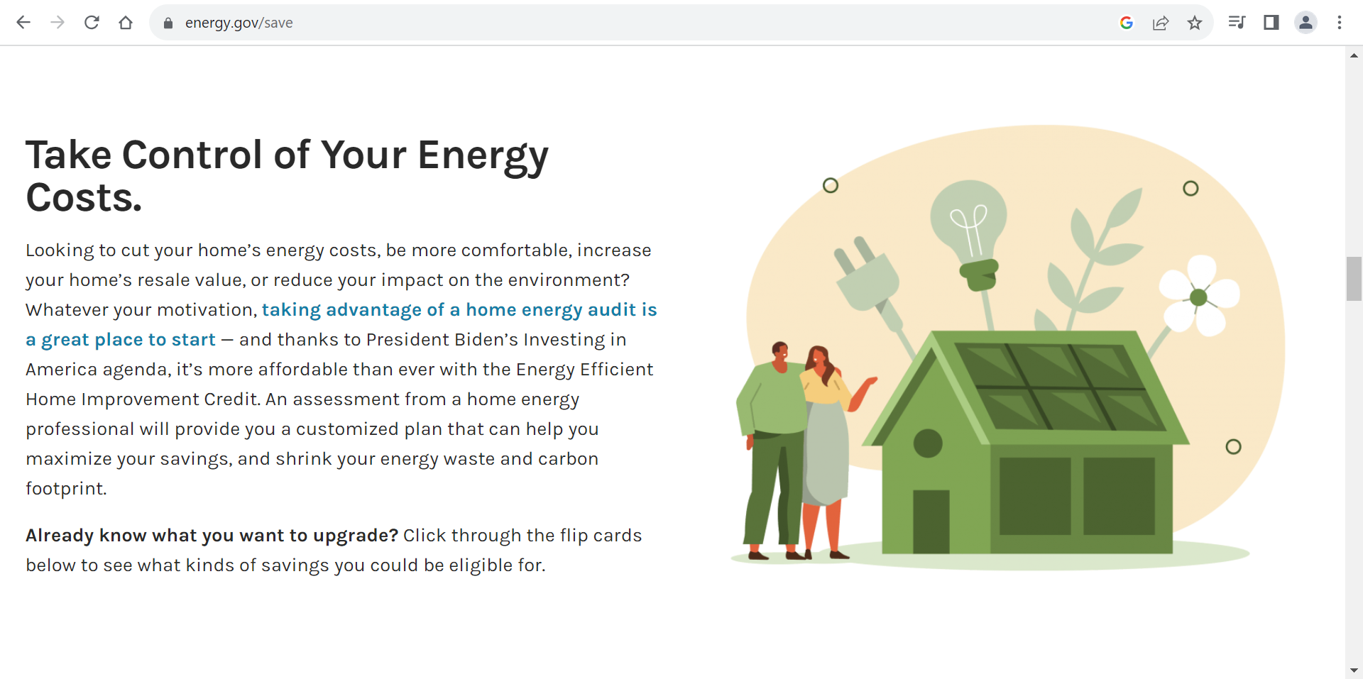
Themed Images
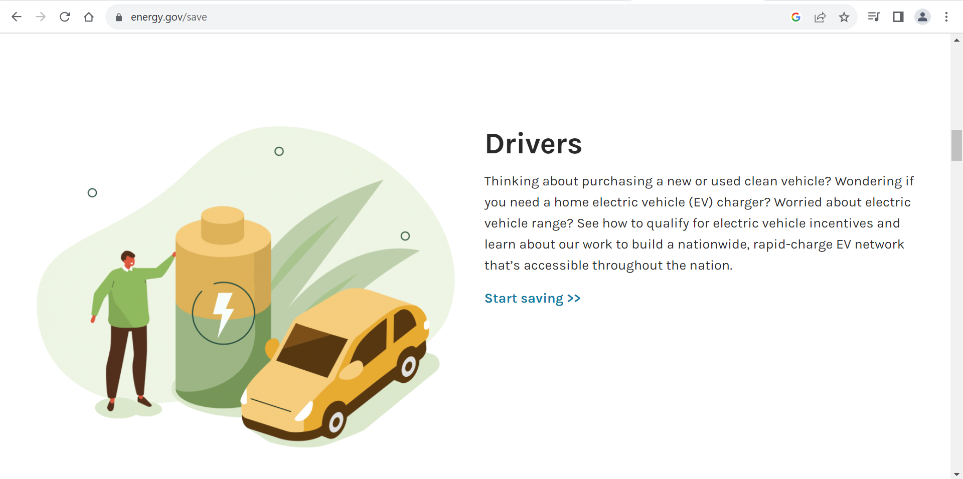
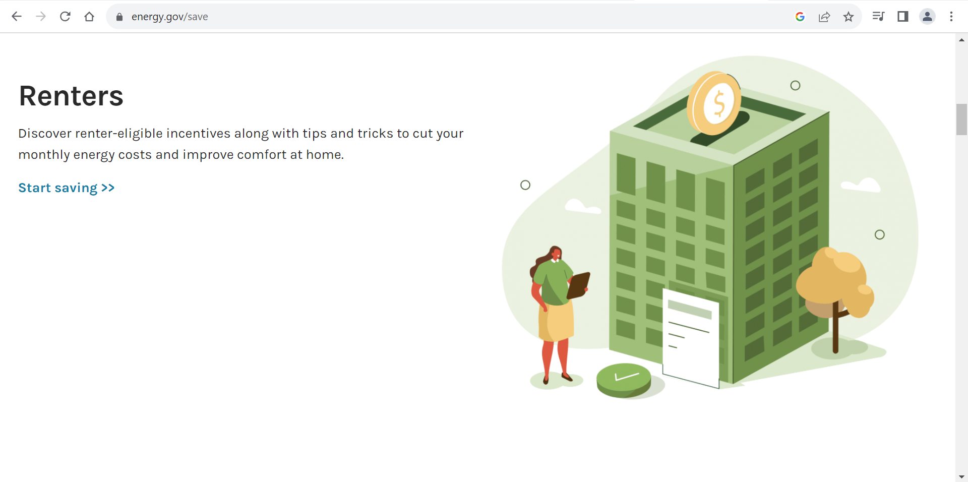
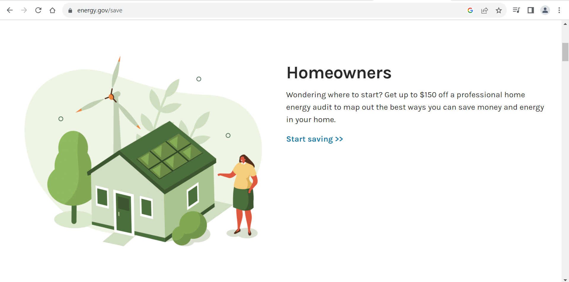
The images on the left are from the Department of Energy website, listed under the “Save Energy, Save Money” section. We liked the color scheme and theme of these images, as well as the fact they all matched each other very well, so we aimed to use a similar set of matching images on our website. This can be seen on the Home page, under the energy solutions section, as well as on the bottom of the sustainable practices page.
Section Transitions
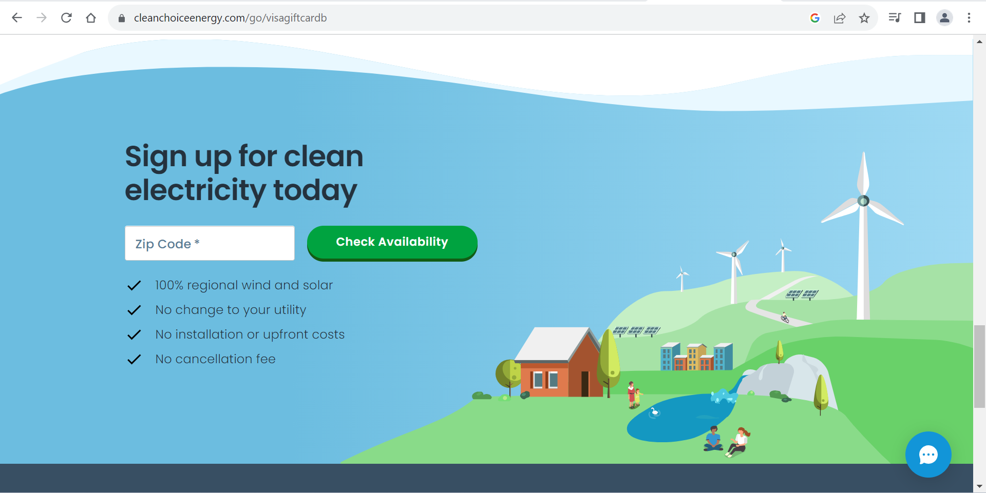
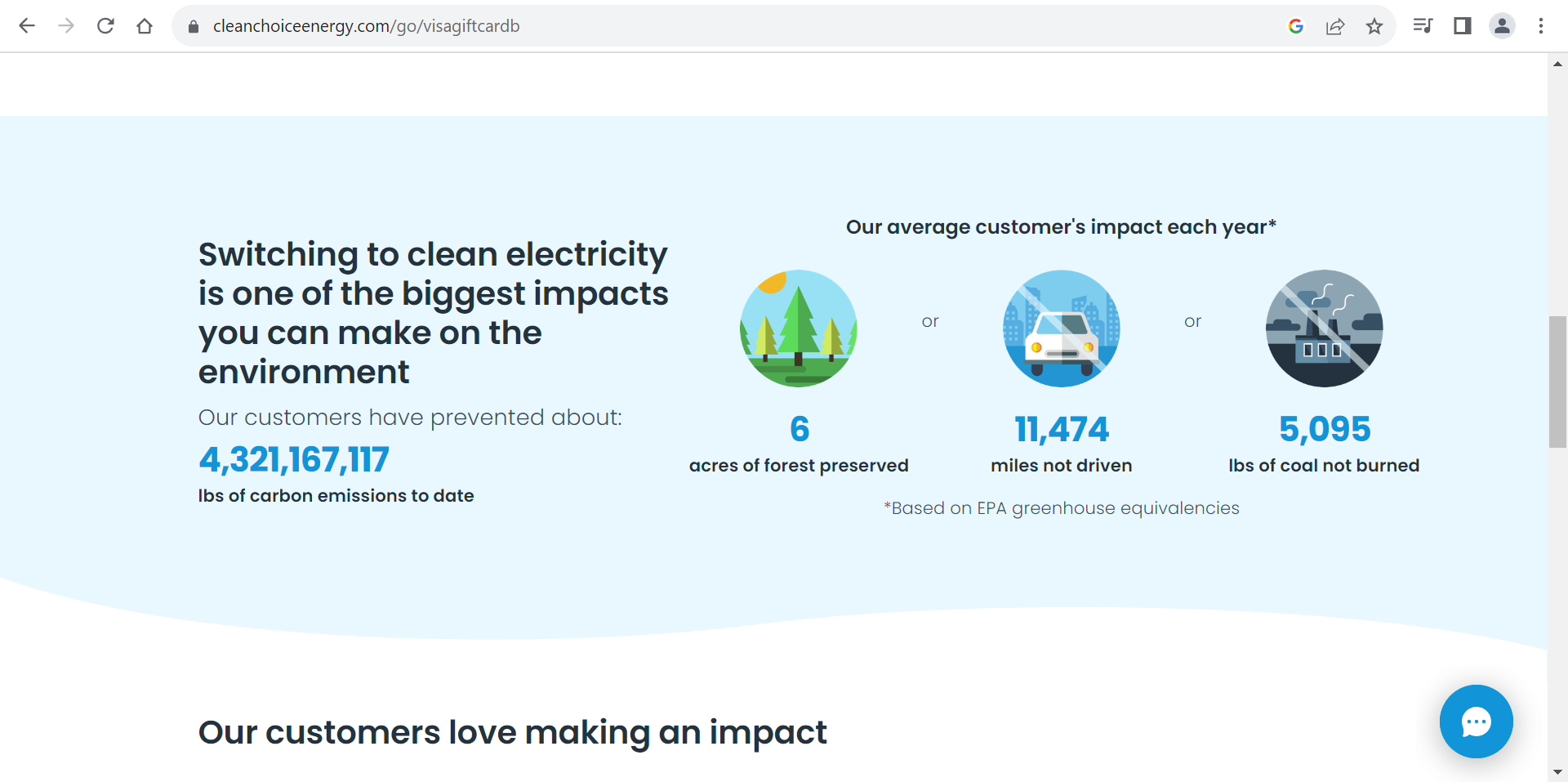
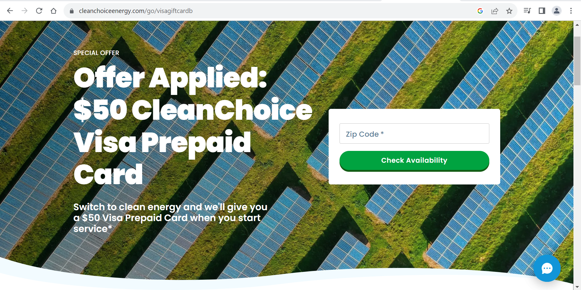
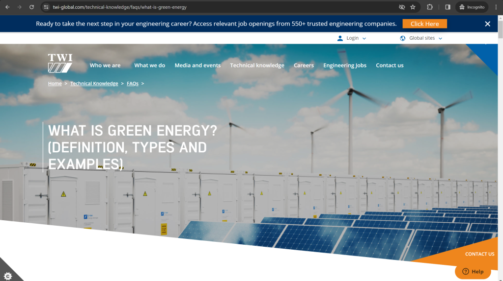
These images all show examples of transitions between sections of a website.
The top images are from CleanChoiceEnergy, and show how a wavy and curved design makes a website look nicer, and allows for smoother transitions between sections. We used this technique on all of our headers for each page, and it adds a lot.
The lower image is from TWI Energy, and shows how sharper transitions can also be used.
Circle Link Icons
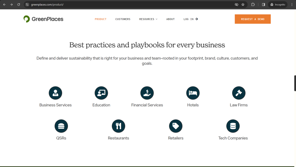
This image is from GreenPlaces, and demonstrates the use of circle icons to show additional information. We took inspiration from this website on our “Sustainable Practices” section of our Home page.
